Human designs

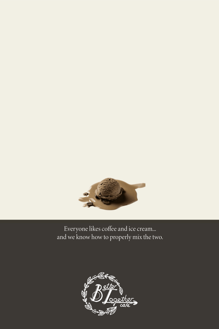
Better Together Cafe Posters
Better Together is a small cafe in South Milwaukee that is owned by a husband and wife who believe some things are “better together,” like coffee and ice cream. I chose this small business as my client because I had a very pleasant experience the one time I went with a friend. The dining area is very inviting and cozy, and the brand is consistent with themes of joy and intimacy.
The first poster (left) is inspired by Herbert Matter, a Swiss designer and photographer, who was especially talented in creating collage-like designs that are unique and off-beat. Herbert Matter’s designs used excellent photography, sometimes captured an “uncanny” feeling, and often had abstract visuals.
The second poster (middle) was inspired by Josef Muller-Brookmann, who was well known for his loud, edgy, and dramatic style. He is still considered to be a leading pioneer in the new design movement from the 1940s, which highlighted bold and intense designs. Muller-Brookmann is well known for minimal colors, a direct message, and cinematic feeling.
The final poster (right) was influenced by a specific poster for Volkswagen, designed by Helmut Krone and Julian Koenig. In 1960, they released the Volkswagen; Think Small advertisement, which features a large open space with a little Volkswagen toward the top left. This design technique is especially inspiring with the idea that “less is more,” using minimal words and visuals.

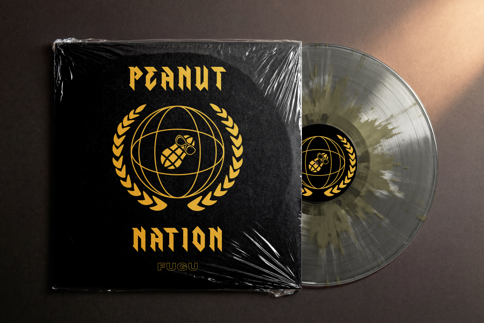
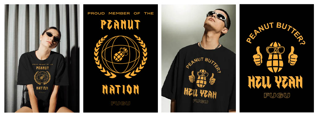
Fugu - Peanut Nation
Fugu is a local band in Wisconsin that often performs in Milwaukee. Their designs capture the light hearted, quirky character of the music they make. Each design is specially made to attract the younger generation and their interest in memes, pop culture, and unique references. Fugu’s newest EP, Peanut Nation, features a cute peanut character with sunglasses, perfect for shirt and sticker designs. The references in these two shirt designs can be heard in their song "Peanut Nation," straight from their latest EP, which can be found on any site you use to listen to music. You can click on the photo of the Peanut Nation vinyl record to find their Instagram.
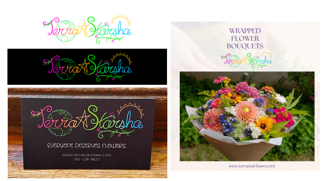
Terra Starsha Logo
Terra Strasha is a new business in West Allis happy to serve the residents with any and all of their flower-related needs. Whether it’s a special occasion or “just because,” Terra Starsha is here to deliver the most gorgeous, freshest bouquets around. The logo for Terra Starsha highlights the playful nature of gardening and bold colors of the flowers they offer. With design inspirations from Lisa Frank, the logo is sure to stand out with its bright color palette and artsy iconography.

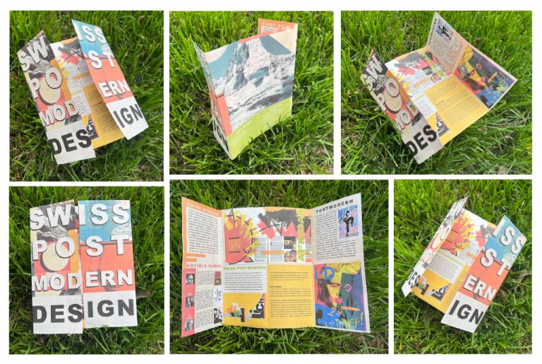
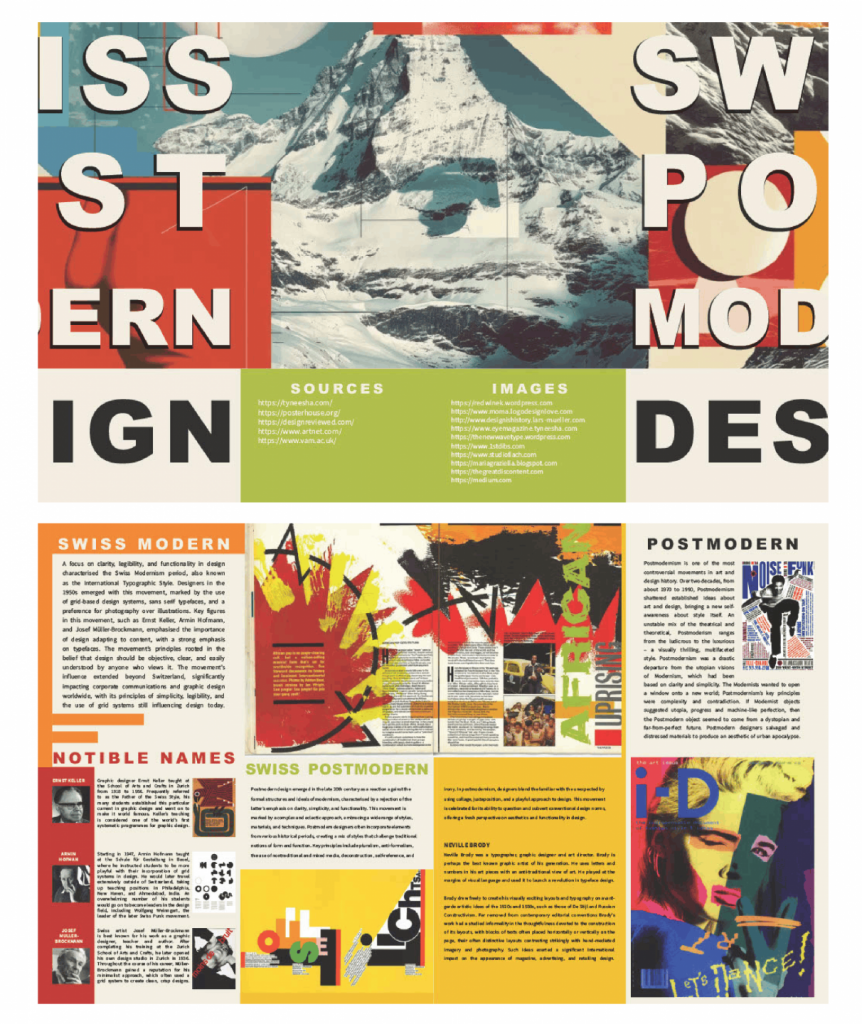
Swiss Post Modern Design Brochure
The purpose of this brochure is to educate the reader on the rich history of Swiss Post Modern Design and the way it’s influenced design as we know it today. The brochure accurately displays this specific design style with more than just pictures of the design, but with the bold colors, blocky display, and simple typography. The brochure is double sided and uses the “gate fold” technique, in which the paper is divided into four sections.
Swiss Post Modern design is a product of the influence postmodern designs had on Swiss styles. The modern style of Swiss design relied heavily on strict guidelines and orderly visuals. The purpose was very practical, the visuals defined clarity, and the font was efficient. Post modern design in itself was rebellious; the old rules and regulations put on design have a hole. The post modern Swiss movement was special because it catered to the chaotic and unruly aesthetics of the up-and-coming design movement, yet there was an underlying current of structured and methodical elements. The disorganization had an air of regulation. Swiss Post Modern Design still uses grids, but a lot more than before, so that the design could still be complex and visually filling. The new norm for Swiss design became a greater use of illusions, something the Modern design was begging for but didn’t know yet. There is still the element of using photographs over illustrations, however, there was a greater use of graphics, like wild shapes and splotches of color.
Bite Me! is the perfect horror-themed food truck for any event, full of creepy photo opps, scary good food, and thrilling merchandise. Every aspect of the brand highlights the aesthetics of classic slasher monster films, from the bloody food wrap to the vampire logo. The Bite Me! food truck has a unique style that makes it stand out from all other food trucks, since it really leans into the spooky design.
Thanks for looking at my designs
You can click any of the icons on the bottom right of my website to find ways to get a hold of me, if that’s what you so desire.

